Skip to content
All workCase study 05 / 05

A quiet, confident identity and website for an architecture practice whose buildings already do the talking.

Client
Atelier Moreira Arquitetos
Year
2023
Discipline
Brand & website
Location
Lisbon, Portugal
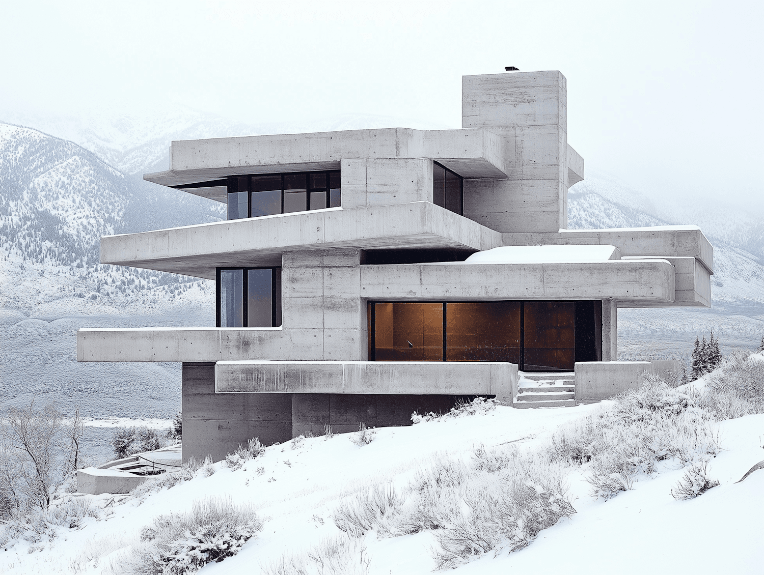
Layered concrete house with warm lit windows on a snowy mountain slope

( What we did )

  • Identity refresh
  • Website
  • Photography direction
  • Print

The challenge

Moreira's portfolio is full of uncompromising concrete homes in extreme landscapes, but the old website buried them in slideshows and jargon. Prospective clients struggled to grasp the practice's philosophy before the first meeting.

Our approach

We stripped everything back to material and light: generous full-bleed photography, a typographic system drawn from the practice's own technical drawings, and project pages structured like a site visit, from approach to threshold to interior to view.

The outcome

Qualified project inquiries doubled within six months, and the practice now opens every client presentation with the website.
( Results )

What changed for Atelier Moreira Arquitetos

  • 01

    2x

    Qualified inquiries in six months

  • 02

    71%

    Of visitors explore three or more projects

  • 03

    1.2s

    Average page load on mobile

( Core palette )

The four colors that carry the Atelier Moreira identity across every touchpoint.

  • 01Concrete#C8C6C1
  • 02Snow#F6F6F4
  • 03Basalt#38383B
  • 04Amber#C68A3E

( Next project )

Brand identity · 2026

Halden Roasters

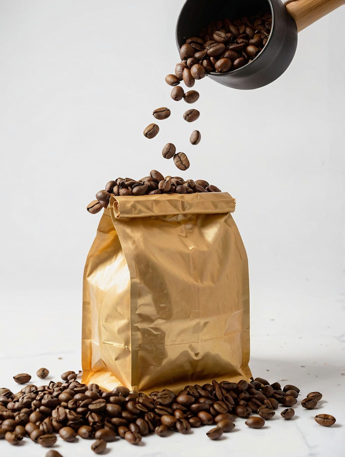
A rebrand for a third-wave roaster that outgrew its garage and needed a shelf presence as bold as its beans.

View case study
Made with Modulify