Skip to content
All workCase study 01 / 05

A rebrand for a third-wave roaster that outgrew its garage and needed a shelf presence as bold as its beans.

Client
Halden Coffee Co.
Year
2026
Discipline
Brand identity
Location
Porto, Portugal
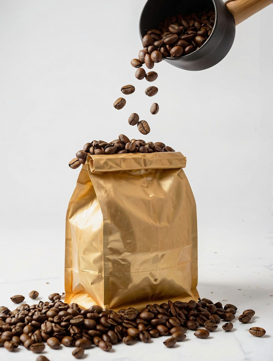
Gold Halden coffee bag with roasted beans pouring in from a black scoop

( What we did )

  • Brand strategy
  • Visual identity
  • Packaging system
  • Café environments

The challenge

Halden built a cult following at farmers' markets, but its hand-stamped kraft bags disappeared on supermarket shelves. The founders wanted to move into retail and open their own cafés without losing the warmth that made their regulars loyal.

Our approach

We rebuilt the brand around the roast itself. A gold foil bag signals craft from across the aisle, while a modular label system gives every single origin its own color, tasting notes and story. In the cafés, ember-orange cups carry the identity into people's hands and onto their feeds.
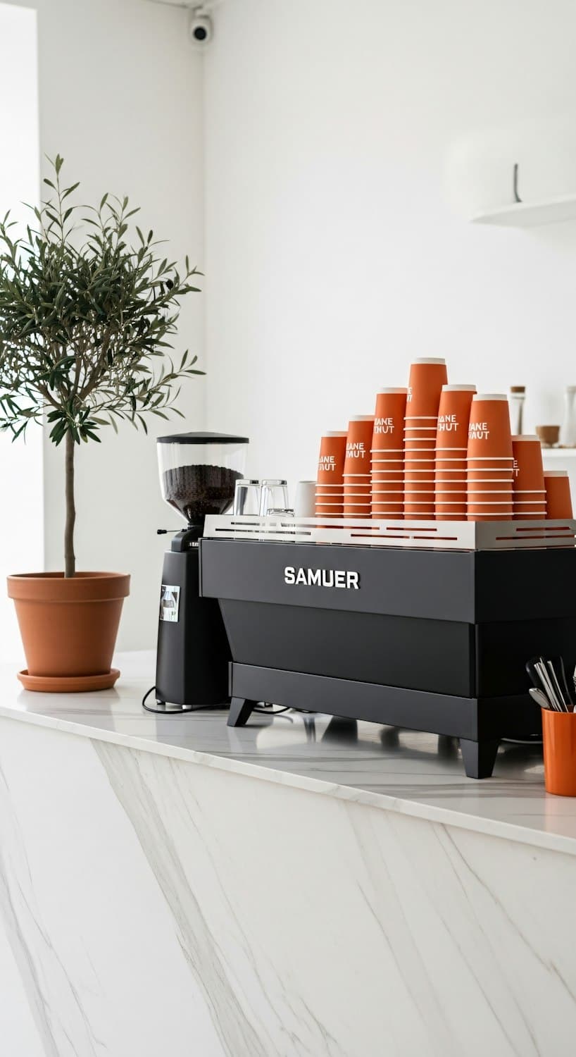
Halden café counter with a black espresso machine and stacks of ember-orange cups

The outcome

The new range launched in 140 stores across Portugal and Spain, and the first Halden café sold out of its opening roast in four days.
( Results )

What changed for Halden Coffee Co.

  • 01

    +38%

    Wholesale accounts in year one

  • 02

    140

    Retail doors at launch

  • 03

    4 days

    To sell out the opening roast

( Core palette )

The four colors that carry the Halden Roasters identity across every touchpoint.

  • 01Espresso#1E1B17
  • 02Gold Foil#C9A15B
  • 03Ember#E8622A
  • 04Crema#F3EDE3

( Next project )

Digital experience · 2025

Lumen Pavilion

An identity and digital layer for a contemporary art space where light is both the medium and the message.

View case study
Made with Modulify